Candlestick charts are probably the most commonly used charts by forex traders. This is the preferred method of displaying price action because these charts provide a quick and easy way to size up the market.
https://youtu.be/smpyD0LmxWs
When looking at candlestick charts there are 3 elements that you should pay attention to.
Color of the candles
Just simply watching what color is prevalent at the moment you can get an instant feedback on who is in control of the market. More green than red candles indicate that we’re in a bullish move or uptrend. Reversely more red on your charts indicates that we’re most likely on a downward trend.
A mix of green and red with no dominating color shows us that none of the players in the market is in control and we’re trading in a range.
Size of the candles
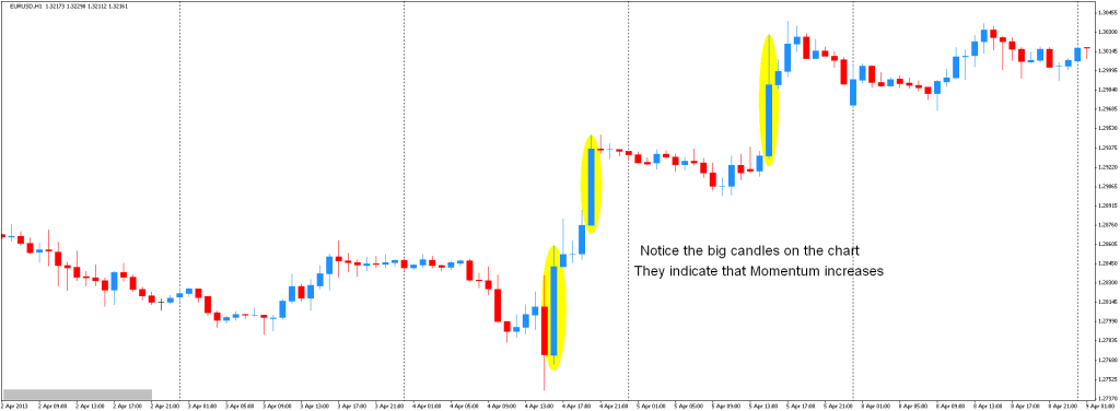
The size of the candles indicates the momentum of the price. Big candles indicate increasing momentum in price while small candles indicate indecision. See the chart below of some recent price action in the Euro.

Notice the big candles on the chart above and how whenever they start to pop up price “makes a run for it”. Momentum increases and trends start to develop.
Shape of the candles
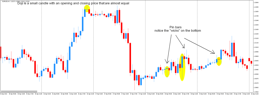
The 3rd element of the candles that you should pay attention to is the shape. The chart below marks shows a type of candle that is called a doji. A doji is a small candle with an opening and closing price that are almost equal. It indicates indecision in the market and a possible reversal.

The other candle shape type that you should look out for is is what is commonly called a Pin Bar. A pin bar is a price action reversal pattern. The chart above shows an example of three of these Pin Bars on the Euro.
Notice the long wicks at the bottom of the candles. The wicks indicate that sellers were quickly pushed back by the buyers as prices change direction. The longer the wicks are the more the odds increase that we might see a reversal in price.


