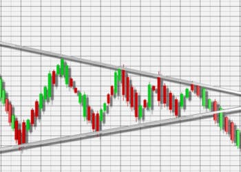
Trade lines are a very important tool in technical analysis. It used for judging entry and exit timing while trading.
What is a trend line?
Trendlines are drawn with a diagonal line between two or more price pivot points. Look at the Daily chart below of the EUR/USD currency pair.
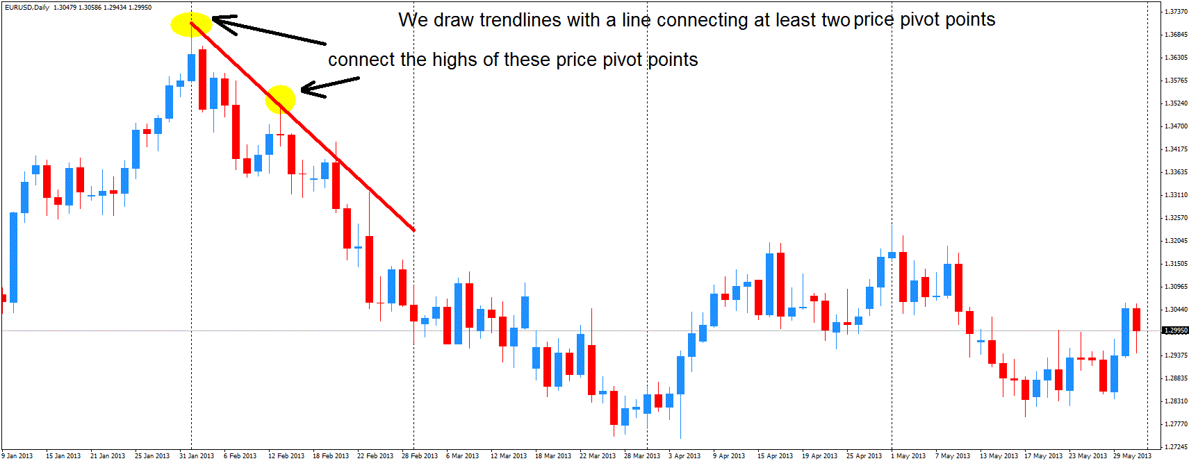
The pair made a significant swing high on February 1st of this year, followed by another significant swing high on the 13th of February. We can now draw a trendline by connecting the highs of these 2 price pivot points. You need a minimum of two price points to draw a trendline, although more is better of course.
How do you trade trend line?
There are two ways to profit from trendlines.
Method number 1 – Look for a continuation of the trend
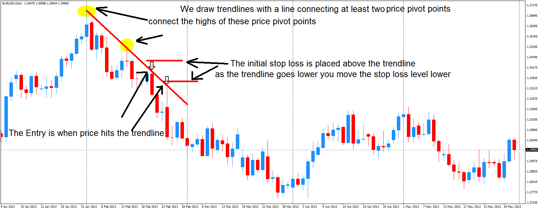
The first and most obvious one are to look for price to turn once it hits the trendline. The chart below shows areas where price hit the trendline only to turn back down.
Where do you enter and place your stops?
The Entry is when the price hits the trendline. These areas are marked with arrows on the chart below. The initial stop loss is placed above the trendline giving us a low-risk entry. A trailing stop is also usually employed when trading trendlines. As the trend line moves lower you move the stop loss just above the line, thus lowering your risk further.
Trendlines are dynamic support and resistance levels
Trendlines are support and resistance levels but unlike horizontal lines which are static in nature, trendlines are dynamic. Notice how on the charts above we only connected the first 2 swing points. If we extend the trendline further down we get the chart below.
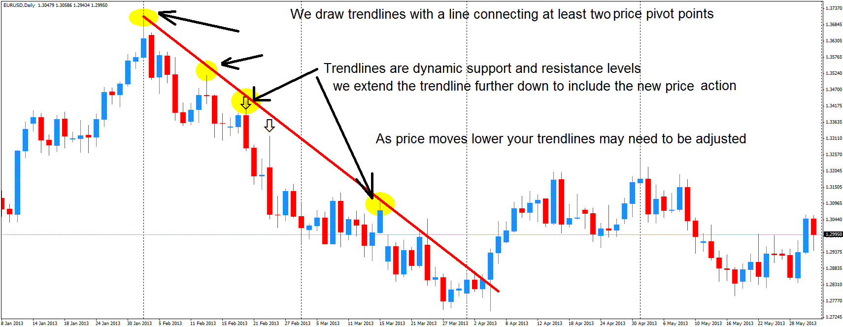
As price moves lower your trendlines may need to be adjusted somewhat to reflect the new price action. Don’t be afraid to make these changes as adjusting the line can lead to more accurate entries.
Method Number 2 – Look for the trend to reverse
The second way to trade trendlines is to look for areas of a possible trend reversal. This happens when the trendline no longer can contain the price. The price makes a breakout and reverses the previous trend. We have identified one such instance on the chart below.
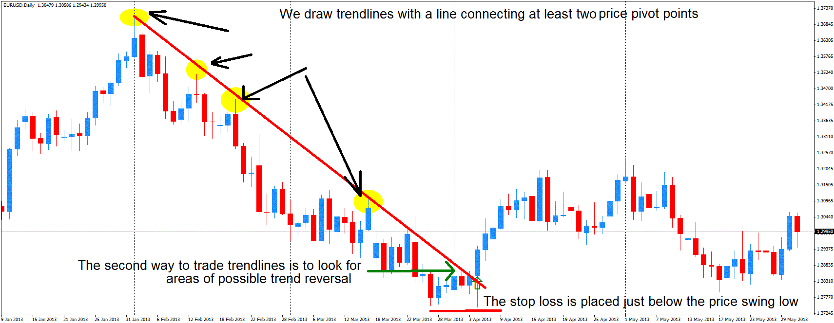
The big 2-month downtrend in the EUR/USD during February and March is drawing to a close as the single currency starts to turn back up. The trendline is broken and soon after we get the first significant price close above the line. The stop loss is placed just below the price swing low.
An Example from the Long Side
Below is an example of the EUR/JPY 1 Hour chart. It shows the same concepts we talked about before just from the long side. The pair made a significant swing low on April 4th, followed by another significant swing low the next day. We draw a trendline by connecting the lows of these 2 price pivot points.


